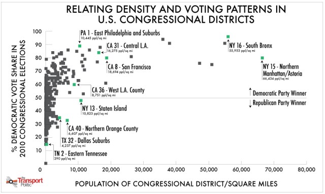
Update 1: Anonymous points out that it says log scale right under the graph. Yep. That’s it right there. I’ve said it before and I’ll say it again: I need an editor. Thanks anon. So it’s actually not strange, but rather perfectly logical. It’s also Friday. Oh well. Still, there’s got to be something we can do with this. Give students the x-axis demarcations and ask them to provide the scale? Linearize the data? Or turn the linear data into a log scale? Regress the data linearly and logarithmically?
And here I was getting all uptight about the Tour de France stage profile x-axes.
(from thetransportpolitic.com)
I’ve no idea what scale that is. I’m pretty sure it isn’t logarithmic, but maybe it is. It’s hard to tell with those demarcations. My hunch is it’s “whatever scale makes the data look most linear”-scale I wonder if there’s a way we can figure that out?
To thetransportpolitic.com’s credit, they show pretty much the same data on a linear x-axis further down the post.
There’s certainly still a visual correlation, but not quite as dramatic as the ??-scale x-axis above. If anything though, it shows that most of the congressional districts have a population density less than 10,000/sq. mile, and it’s the super-dense congressional districts that are the outliers. Let’s revisit this at a later date, shall we? There’s got to be something we can do with this. Any suggestions?

