Artifact

I’ve got bad news for everyone here in the Fort Collins area: there’s a chance of showers on Labor Day (September 2). It’s a shame because the following Monday (September 9) shows a mostly sunny day, with a high of 77 degrees. (I am writing this on August 8.)
Seriously, AccuWeather? Yes, AccuWeather is releasing a 45-day weather “forecast”, although it’s actually just more of a trendline (it will be colder in October than it is now in August, probably a safe bet). It will predict the highs, lows, and chance of precipitation up to 45 days in advance. Presently, I cannot quantify how terrible these forecasts will be, but they will be terrible.
So that’s the silly portion of this blog post. To me, the more interesting questions are as follows.
Guiding Questions
- Is a 2-day forecast error prone? What about a 7-day? At what point to weather forecasts become statistically useless?
- Is there a regional difference in weather forecast error?
- Which weather forecast models are more accurate for your region?
Suggested Activities
- Solicit predictions. How accurate do you think weather forecasts are? Do you think a 2-day forecast is appreciably more accurate than a 5-day forecast? Do you think it depends on the region you’re checking (i.e. does, say, a dry climate have more error than a wet climate? do the coasts have more forecast error than the plains?)? Can we quantify any of this?
- Start collecting data. Keep track of the 2-, 3-, 5-, 7-, and shoot, the ridiculous AccuWeather 45-day forecasts. Compare it to the recorded data (you could stick a max/min recording thermometer out your window, or check archived data). Grab the highs and lows, and possibly recorded rainfall. Yes, the 45-day forecasts won’t start paying dividends for a couple months, but that’ll be some pretty rich data (“rich” has a couple different meanings in this case) to have collected. And thankfully, if you’re teaching Algebra 1, a lot of curriculum maps out there don’t have the “Statistics” unit until late in the year.
How to collect the data? Well, Google Forms makes it nice and easy to record data. See, look, I made a Google Form for you and your students to use. The only tricky part will be some spreadsheet column manipulation, correlating the forecasts with the appropriate weather data collection dates.
- Develop a method to calculate the error of the forecast. Depending on the grade level, your class could certainly develop an error model based on whatever sophistication you feel appropriate. Maybe an elementary class will just take the differences between the forecasted and collected highs and lows. Maybe a middle or high school class will develop something more sophisticated. Something like Mean Square Error should do nicely.


- Compare model to model; compare region to region. Which weather model was the most accurate for your region? What if you just took the average of all the forecast models? Would that result in a better prediction? Some forecast sites to check:
- Weather Underground (wundergound.com, my personal favorite)
- The Weather Channel (weather.com)
- National Weather Service (NWS, weather.gov)
- (Ugh.) AccuWeather
- Toward the end of the year, have students begin making their own Highs, Lows, and Precipitation prediction. By the way, these competitions happen all the time in the atmospheric science community. Maybe after some year-long analysis, your last couple weeks are spent gaming around students making their own predictions. They can look at all the forecasts and make a judgment. There are several ways to “score” it, some are more intense (scroll down to “scoring”) than others. Like collecting the data, Google Forms could be helpful.
If you’re looking for a long-term project that all students can access and be involved in (low barrier of entry, high ceiling), you could do worse than tracking weather forecast accuracy.
Teacher’s Edition
I’ve got some news that will probably shock you: 2- and 3-day forecasts are actually pretty good. And they’re getting better.
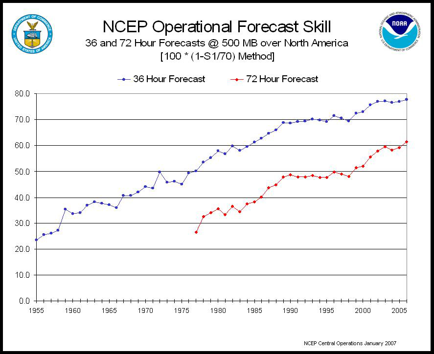
But this is me telling you that things are getting better and just citing some peer-reviewed research. That’s not necessarily what we do here. This is where you and your students could potentially come in.
For more on weather and weather forecasting, NCAR/UCAR has some excellent resources.
Update 8/9/2013:
Huge thanks to Frank (@fjvitale) for finding some graphs that better show improvement in TEMPERATURE forecasting. Here’s one that shows the error of MAX temperature forecasting for several different day forecasts since 1972.

You can find more forecasting verification graphs here.
(More of my posts on weather and climate.)
