
We all acknowledge that data analysis and representation is a key part of our math curricula in the 21st century. But while it’s baked into Common Core and other state standards, it can be a bit unwieldy at lower grades. One of the barriers between students and sophisticated data analysis has been (until recently) lack of elegant software or applications appropriate for elementary students. Excel was never meant to be an instructional tool, yet if you want to create a bar chart digitally, it’s the default and ubiquitous option. Or its sister, Google Sheets.

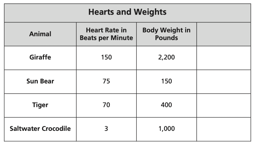
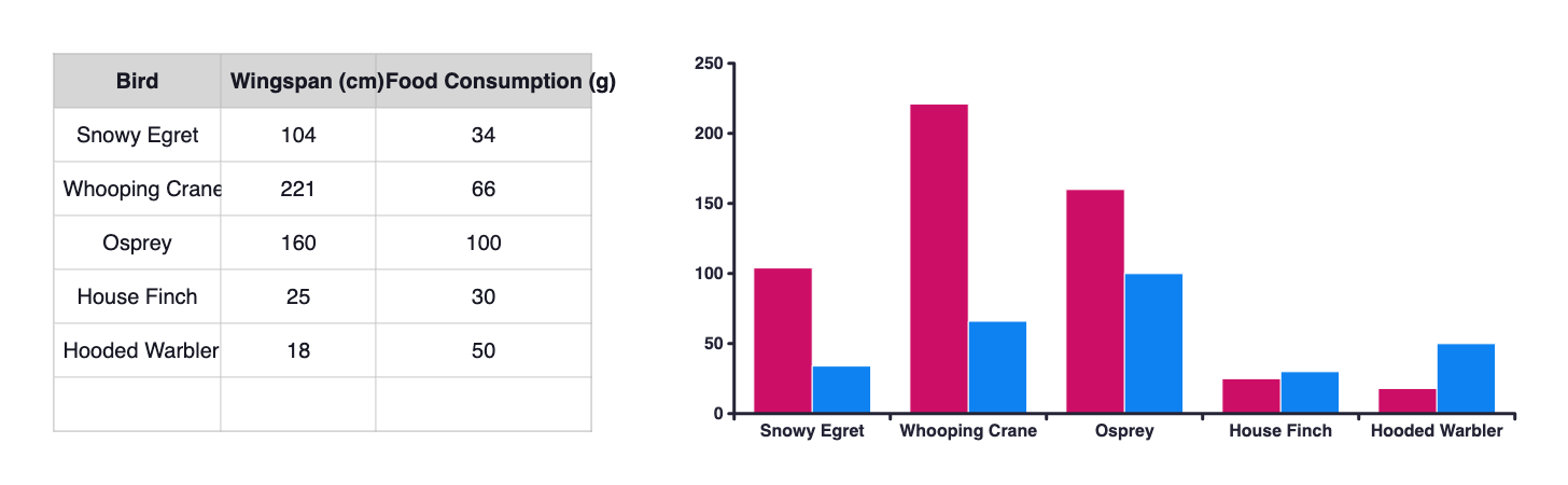
I recently taught a class using the “Seeing Animals in a New Way” task from Mindset Mathematics (Grade 6). It’s a very nice task that asks students to craft a chart that compares aspects of animals: length of animal and jumping ability; weight of animal and X. I gave my students the option of using whatever digital charting tool they wished or grid paper for their representations. Two groups chose Excel, one group chose grid paper. Unfortunately, the lesson turned from an investigation into representing data and exploring ratios turned into a relearning of Excel: how do you organize the data again? Where’s the button that lets you name the axes? Eventually we got there, but the mathematics slid into the background as we were trying to recall how to format the columns and what exactly to drag and drop around.
Therein lies the problem with teaching data visualization at the elementary and middle grades: it’s a pretty clunky experience. And sure, digital curricula have adapted to allow students to interact with data with a better user interface for students, but those applications aren’t generalizable: the interface differs from curricula to curricula, you have to log in to operate with the applications, they’re proprietary, etc.
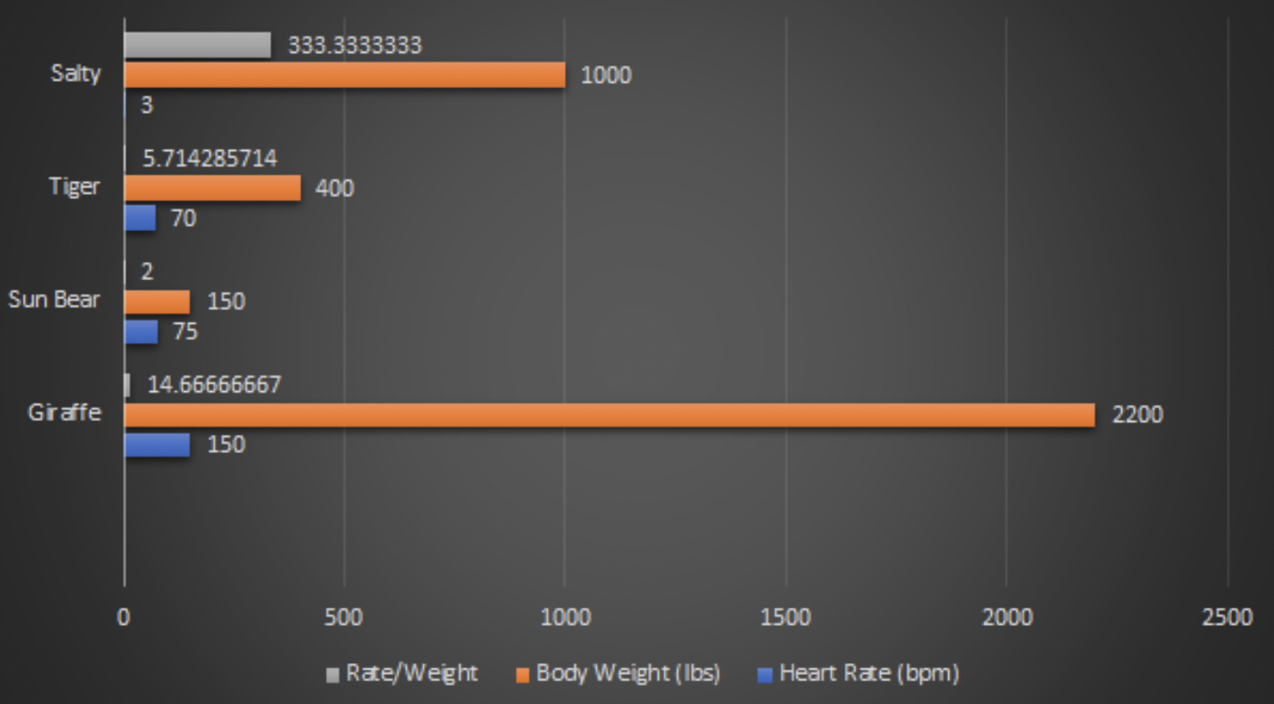
I then showed my students the charting feature on Polypad and how easy it was to generate multileveled data visuals.

My students were amazed and immediately wanted to learn how to create such lovely data visuals by dragging and dropping.
So here’s how easy it is.
- Plop a table onto your Polypad board and fill it up with data. The table is under the “Probability and Data” tiles. You can go with your classic “x” and “y” labels, or change them depending on how you’d like the data to show up in the chart.
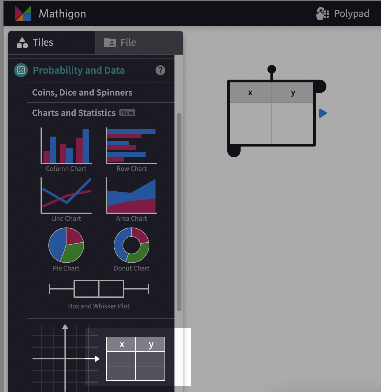
- Adjust the number of rows and columns you might want. If you’re presenting a bar chart, the first column is going to be the label for each individual datum, the independent variable as it were.

- Plop your chart of choice on to the polypad; drag and drop your data onto the chart and voila!

Adding additional columns will induce the chart to place those data as well.
Excel is nice because it’s ubiquitous and powerful. It’s not particularly great for young students to interact with. It wasn’t meant to be a teaching tool. There are certainly limitations to polypad’s data features, but that’s a good thing when students are first learning to interact with digital data visuals.
On a general note, I fear as the semester has moved along, I’ve become a bit of a Polypad fanatic. I’ve been using it in every class I teach and every professional development I’ve run with teachers. It’s a truly well crafted tool and has only improved in the past year or so. I’ll probably write more about additional features I enjoy, such as the fraction bars, number tiles, pattern blocks, and the “bucket of zero.” But for now, enjoy the data dives with your young’uns!
Still, I am a little worried when I talk about PolyPad I sound like these guys.

