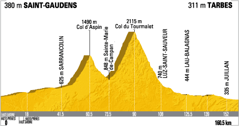
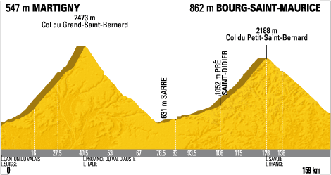
This image and its ilk bothers me to no end. This is a profile of the 9th stage of the Tour de France*.
(image adapted from letour.fr)
So I had this simple little post in mind about the Tour de France and biking and elevation and distance and it would wrap up neatly into a little Pythagorean Theorem lesson. I start looking around for nice little diagrams much like this one, showing the distance and elevation. The idea was going to be simply, “find the absolute distance the bikers travel in this particular stage.”
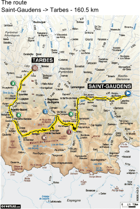
But it turns out these diagrams are a sham. An absolute sham. You see, the x-axis already does represent the absolute distance. Take this stage, for example. Above is the “cross section” of the stage. And here’s the actual route.
Note the exact same distance peddled. So x-axis is in actual distance peddled, not simply the horizontal distance traveled, as any proper diagramer should do. I suppose it’s more helpful for the bikers to know the absolute distance they have to travel, but it’s …. it’s….. it’s… just wrong. In retrospect, I did sort of think these slopes seemed a tad steep….
So we have a new task.
Artifact
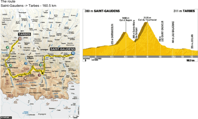
Display these pictures side-by-side and give a candy to whoever can tell you what’s wrong with the cross section picture.
Once the bright little rays of sunshine figure out that the x-axis is not representative of the horizontal distance, let them know that they are going to be the ones to fix the x-axis and generate a whole new, better, correct set of Tour de France cross sections.
Guiding Questions
- What’s wrong with these cross sectional diagrams?
- What would the correct diagrams look like?
Suggested Activities
- Provide extra large paper (i.e. butcher paper, poster paper) for students to recreate these diagrams, labeling the axes properly.
- Or, have students diagram it out and construct a diagram in Excel.
Solutions
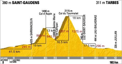
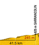
First, let’s break the stage up into a bunch of right triangles, labeling the distances as we go.
The thing to watch out for is the distances in black are actually the diagonal of the right triangle, or the distance peddled. For instance, if we look at the first stretch here,
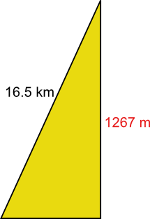
in a “proper diagram”, it would look like this:
Watching out for the units, and applying Pythagorean’s Theorem, we find the horizontal distance.
OK so that won’t change the diagram a whole lot. I guess when the horizontal distance is thousands of times longer than the elevation gain, that won’t make much of a difference, will it?
Let’s try one of the steeper sections.
This should actually be the following.
Again not a huge difference, but a difference nonetheless.
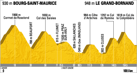
Here are a couple other stages of the Tour de France that could stand to be “corrected” by your class.
========================================
Some comments:
- Truth be told, the difference in x- and y-axis scaling does more to alter the look of the diagram than the neglect of using the proper horizontal distance as the x-axis.
- Still, this makes for good Pythagorean Theorem practice, if not its teaching.
- We could apply this to pretty much any elevation change: mountain driving, hiking, the ascent and descent of an airplane, etc.
Here are a couple more stage profiles of the Tour de France for your perusal.
Stage 16
Stage 17
* – the original post contained the typo “Your de France”, which is probably a good tagline for a Tour de France fan-club, but was not the intention of the piece.
