Update (3/12/2013): An atmospheric scientist friend of mine, Katie, suggested a few edits to this post, primarily to clear up a few of the tools listed here. The edits are in bold.
My initial thesis on this post was originally going to be “why don’t teachers let students investigate global warming very often?” While this may not answer it here’s a terrifying google search for any teacher who is interested in having their students do some independent research on climate change. Google: “global warming raw data“.

So the first result is a good one. A legit one. There are lots of links to reputable sites maintained by reputable scientists. Then the second result is a yahoo! answers post. The the third (third!) google result for a simple query on raw data turns up World Net Daily, a website for conspiracy theorists and people that think they’re going to be put in FEMA camps any day now. That is not a reputable site. They provide the opposite of “raw data”.
This is not a post about the messy politics and confusion-campaigns around climate change. But this does point to a particular difficulty that you’d hope would be much simpler: where can we find raw temperature data that we can actually use? For the record, a google search of “raw temperature data” yields much more acceptable initial results. But still, many of those results can be extremely difficult for a secondary math or science teacher to pick up and use, let alone students. For one, climate data is often presented in a file format that requires heavy coding knowledge or special programs to process (such as NetCDF). Second, it’s hard to know where to start with temperature data. Do you start by geographic location? Do you take the annual mean across the globe? How would one do that, exactly?
So this is the problem, and maybe a fundamental problem of teaching science: data are messy. We have to rely on others to package it for us. Scientists are interested in providing the raw data because they want people to have access to true observations, but that raw data is so vast and difficult to process (but not that difficult to interpret!) you have to get at least a Master’s degree before you can even start to decipher it. And often, scientists aren’t interested in culling the data to make it more digestible for the public. They’d prefer to show you the graph. This is great for communication, but not great for independent research. And worse, they’re now fighting on the same plane as disingenuous charlatans who are paid to be as such. So let’s provide students of science the raw data in a way that anyone with Microsoft Excel and a genuine curiosity can begin to explore the very real phenomenon of climate change.
My favorite site that does that is this NASA’s GISS Surface Temperature Analysis. In terms of accurate, raw, commentary-free, accessible, customizable, and processable data, I haven’t found a better place to start. Bookmark that site. Tell your students to go to that site. Start locally.
To find specific historic local weather stations, Katie recommends using the map rather than the search function. The map appears to have better functionality. So click on your favorite vacation spot and go find that precious, precious raw data.


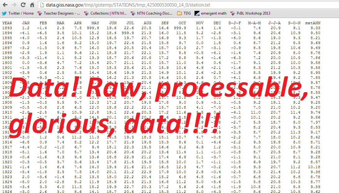
Once you have the ASCII data (shown here), it’s simply a matter of copying and pasting it into Excel, or if you’re incredibly ambitious (or teaching a Stats class perhaps), having students import it into R, one of the industry standards.
For the uninitiated, let me translate a few things:
D-J-F= December-January-February average
M-A-M=March-April-May average
J-J-A, S-O-N = I think you get the idea….
The last column, metANN = annual mean temperature. This actually might be the best first place to start.
Berkley also has a nice data set organized by country. However, the accessible to-layperson data is a bit more hidden.

If you’re not careful, you’ll end up downloading intense, non-accessible-to-the-layperson, NetCDF data. Which, again, is fantastic data, but difficult to work with yourself.
But now we’ve got two sites with data that can be tossed into Excel, R, or even those statistics packages designed for secondary students. Now that we have that data, we can do a lot with it.
Suggested Activities
- Have students investigate the temperature trend in their area.
- Create a linear model that predicts temperature as a function of year locally.
- Assign each group or student a different region of the world to investigate and develop a linear model for.
- Or what about this: develop a sinusoidal equation that describes monthly temperature. Get some trig in there.
- Ask the question: is our town/state/country/planet heating up or not? Or is it too uncertain to tell?
- Can you find local stations that DON’T show a warming trend? Katie suggests looking at weather stations closer to the poles to consider the potential impact of polar temperature trends. This might be a bit science-y, but it’s something I’d happily let students explore in a math class.
Once you have actual data, you can start to test it to assess that last, fundamental question (which then spurs thousands of other questions, like “should I have children?”). Is ß>0 under the general linear model? Once we have that answer, even if it’s just locally, we can start to talk about the implications.
