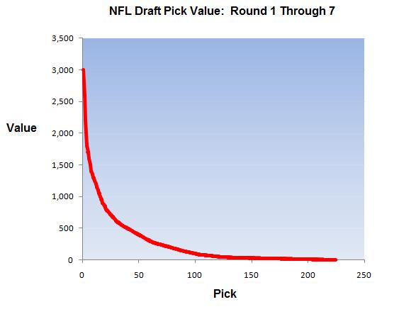
The 2011 National Football League draft of players is tomorrow, and I was inspired by a really interesting post over on Mr. Honner’s blog regarding the NFL Draft Pick Trade Value chart and exponential decay. The gist is this: somewhere, sometime, someone came up with a chart that assigned a numerical value to every pick in the NFL Draft. I’ll let Mr. Honner describe the chart:
It turns out that football analysts have created a trade value chart that essentially standardizes the value of picks . For example, a team holding the 7th overall pick, valued at1,500 points, might expect to receive the 21st pick (800 points) and the 26th pick (700 points) in return, were they to trade their pick. This conventional valuation helps establish fair prices for trades, as it would in any commodities market.
I couldn’t have said it better.
Anyway, Mr. Honner established that the values of the draft picks decay exponentially (for some reason).
My questions were these: do NFL teams actually adhere to this chart? And how can we tell? And is there anything this data aggregation can tell us about horse-trading NFL draft picks?
Here’s a link to every draft day trade involving pick-swapping since 1992.
So let’s start putting together for use in a classroom.
Artifact.
Guiding questions.
- Do NFL teams follow the chart as accepted value for draft picks?
- Does this chart relate at all to what happens on the field?
- Why is there such a quick exponential drop in draft pick value?
- Do teams that trade for higher picks tend to get better value or teams that trade for lower picks?
Suggested activities
- First off, finding the exponential decay function that fits the chart could be interesting. Mr. Honner’s thankfully done that for us.
- Class discussion: how can we tell if teams are following that chart?
- Lotta data aggregation and manipulation. Excel to the rescue?
Potential Solution
A couple caveats before we begin:
- The trading data do not show any additional players that were involved in the picks swap. For instance, teams often trade a draft pick for picks + a player. That is not reflected in the data.
- Oftentimes teams trade future years’ picks. It’s tough to assign a value to that since that particular pick is in flux. For instance, if I trade a 2011 pick for a 2012 first-round pick, I don’t know immediately where that 2012 first-round pick will land. So I threw out all trades involving future picks.
Now onto some solution.
Here’s a terrible-looking spreadsheet I threw together attempting to aggregate the total pick value of both sides of a trade. The team that traded the higher pick is on the left. I called them the “Higher pick trader picks“. I’m not very creative. Conversely, the info on the right is the “Lower pick trader picks.” Each row represents a different trade.
The total value of the team’s picks that traded away the higher pick is listed in the green column. The total value of the other teams’ picks are listed in the purple column. (note: you’ll have to check it out in full-screen or download the document if you really want to see the spreadsheet in its full glory).
If we make a scatterplot of all the trades we can visually see if NFL teams basically follow this trade chart value. If the linear slope is one, then that’s a perfect trading match. That’s what I’ve done here.

Surprisingly, that’s a pretty good fit, meaning for the most part teams roughly adhere to the trade value chart. The slope is nearly one (0.972). A couple of things jump out at me.
Overall, a slope of 0.972 – or, less than one – suggests that the team that trades away the higher pick is getting the better value (this might be a good place to spot and let students ponder as to why this is), presumably in the form of multiple picks.
That said, for the extremely high-value pick trades (where the value of the traded picks exceed 2000), according to the draft chart, the teams that trade away their valuable, high picks are getting less value. Of the 5 trades that involve higher than 2000 points, 4 of them gave the advantage to the team trading away their lower picks. This is due to the extreme top-heaviness of the trade chart. To wit, according to the chart, the #1 overall pick is worth three times the #16 overall pick.
We could also plot the best-fit line as the horizontal axis as a really good visual of the alleged benefit of trading away higher picks in favor of more lower picks.
If we accept the trade chart as true values, then according to history, we have two suggestions for NFL General Managers:
1) In general trade away your higher picks for multiple lower picks.
2) However, DO trade up for extremely high picks (top 5).
You’re welcome, NFL GMs. Make the check out to Emergent Math. And be sure to give Mr. Honner a cut too.
